
Darko Karać |Interview
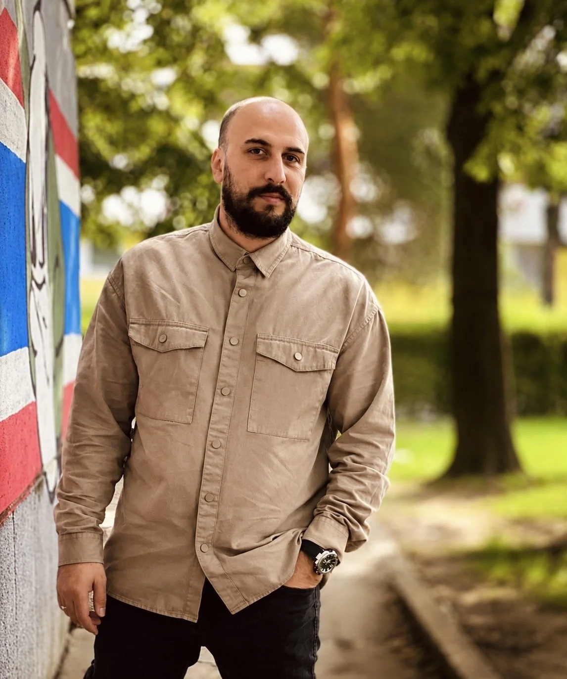
Pictured: Artist Darko Karać
“I see poster design as a statement, a form of resistance, and a way to give visual shape to things that are often difficult to say
”
Darko Karać is a Bosnia and Herzegovina-based artist and graphic designer whose work uses the language of poster design to explore complex social and emotional realities. With a background in sociology, his practice is shaped by an interest in truth, silence, mental health, collective memory, trauma, identity and the fragile position of the individual within society. His posters are visually reduced and conceptually sharp, using simple forms, empty space and symbolic imagery to reveal what often remains hidden beneath the surface.
In this interview, Darko reflects on poster design as a statement, a form of resistance and a way to give visual shape to things that are difficult to say. Speaking across works including Classified, I’M FINE, STOP PLAY and Inspiring Hope, he discusses emotional concealment, social pressure, war, hope and the quiet struggles people carry but do not always show
How would you describe your artistic practice at this point in your journey?
At this point in my journey, I would describe my artistic practice as a search for clear visual language that can speak about complex human and social experiences.
I am especially interested in posters because they demand clarity, reduction, and emotional precision. A poster has to communicate quickly, but I believe it can still leave a deep and lasting impression. My work often begins with a social or emotional question, and then I try to reduce it to a simple visual metaphor.
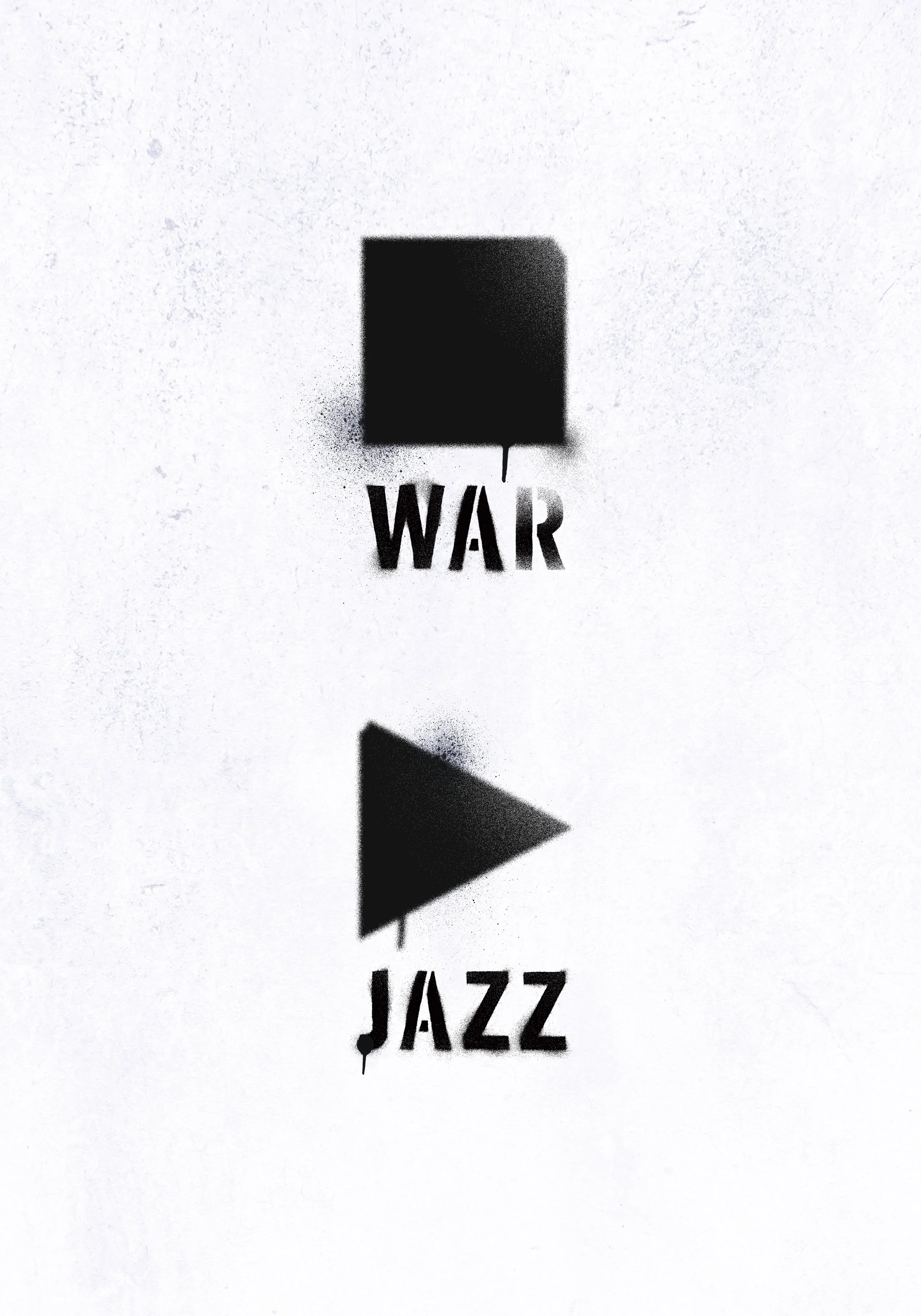
Artwork: ‘STOP PLAY’
What feels most central to your work right now?
What feels most central to my work right now is the relationship between the individual and the pressure of the world around them. I am interested in silence, truth, mental health, collective memory, trauma, identity, and the things people carry but do not always show.
What themes, ideas, or questions are you currently exploring through your work?
I am currently exploring themes connected to emotional survival, social pressure, truth, silence, memory, and the fragile position of the individual inside larger systems. I am interested in the quiet forms of struggle that people experience every day, especially those that are not always visible from the outside.
Some of the questions that guide my work are: What do we hide in order to function? How much pain can exist behind a simple sentence? What happens when society expects people to stay strong, silent, and composed? And how can a simple visual image reveal something that words often fail to express?
Can you tell us about the artworks you are presenting with The Alchemical Art, and what ideas connect them?
The artworks I am presenting are Classified, I’M FINE, STOP PLAY, and Inspiring Hope. Although each piece addresses a different subject, they are connected through a shared interest in human experience, social pressure, communication, and the realities that often remain hidden beneath the surface.
Classified explores themes of secrecy, restricted information, and the power structures that determine what can be seen, known, or revealed. Using a reduced and symbolic visual language, the poster reflects on the tension between transparency and concealment in contemporary society. The work invites viewers to consider how information is controlled and how what remains hidden can sometimes be as significant as what is openly presented.
I’M FINE deals with the distance between what a person says and what they may actually feel inside. The phrase “I’m fine” is often used as a small everyday mask. It can be polite, automatic, defensive, or protective. Through a minimal composition and symbolic visual elements, the work reflects on emotional concealment, endurance, and the silent struggles that often remain invisible to others.
STOP PLAY was created in response to the theme In Jazz We Hope and explores the fragile space where art, memory, and conflict intersect. The title combines two opposing commands—*stop* and play—creating a contradiction that reflects the tension between destruction and creation, silence and expression. Inspired by the experience of war and its lasting impact on individuals and societies, the work considers how artistic expression can become an act of resilience and hope. Through this contrast, the poster invites viewers to reflect on the role of art and music as forces that endure even in times of uncertainty, trauma, and conflict.
Inspiring Hope is a visual reflection on the human capacity to endure and move forward, even in difficult circumstances. The work focuses on hope not as something loud or idealized, but as a quiet force that helps people continue despite uncertainty, setbacks, or emotional weight. Through a simple and restrained visual language, I wanted to express the idea that hope often exists in small acts of persistence. For me, the piece is a reminder that even in challenging moments, the possibility of moving forward remains.
All four posters were created through a graphic design process focused on reduction, symbolism, composition, and conceptual clarity. I am interested in how simple visual forms can communicate complex emotional and social realities. Rather than illustrating ideas directly, I try to create images that leave space for interpretation while maintaining a strong conceptual core.
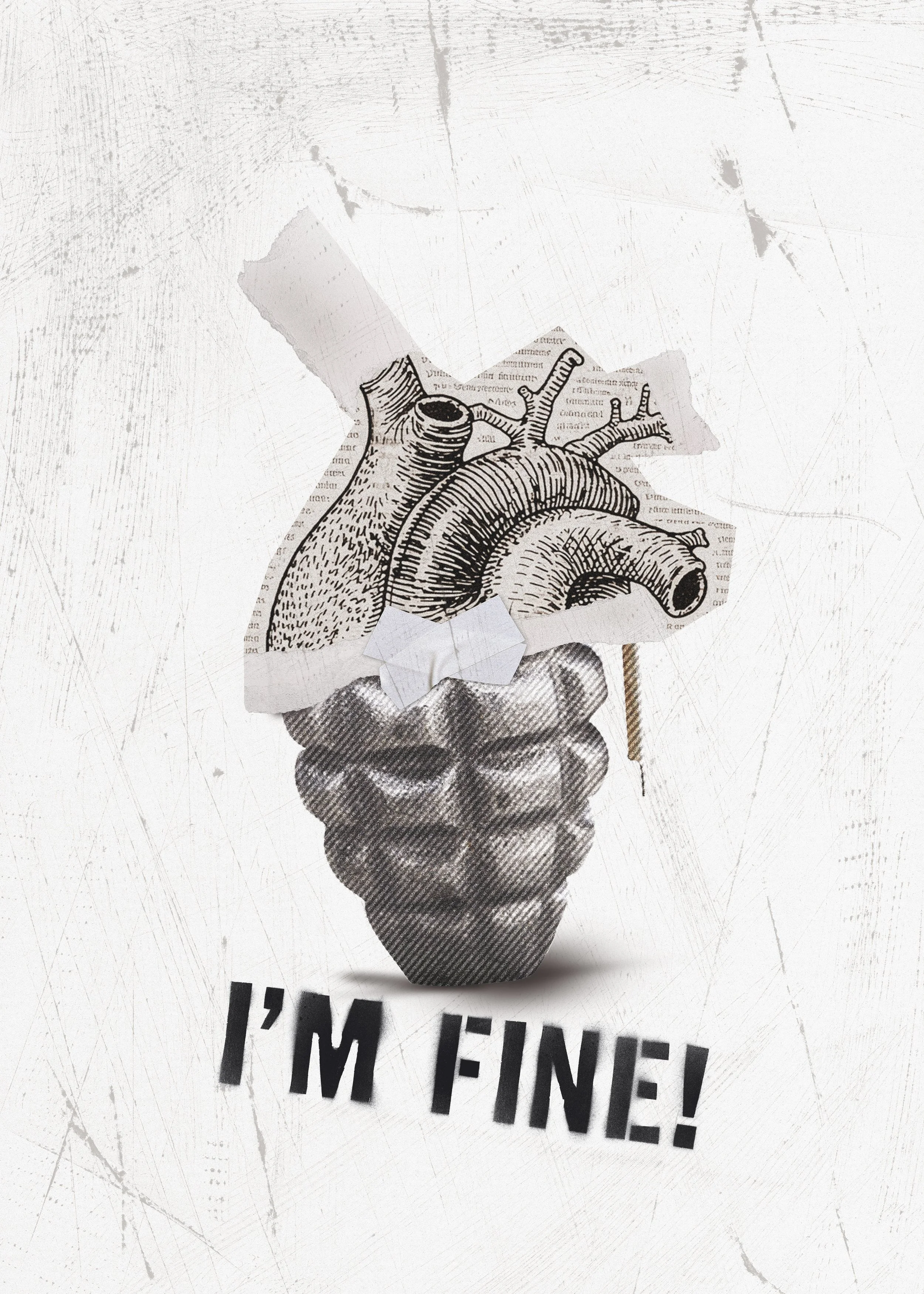
Artwork: ‘I’M FINE’
How does your process usually begin, and how does a work tend to develop?
My process usually begins with an idea, a sentence, a feeling, or a social situation that stays with me. I often start from something simple but emotionally charged — a phrase, a symbol, a contradiction, or a visual association.
From there, I try to remove everything unnecessary. I sketch, test compositions, reduce forms, and look for the strongest relationship between image and meaning. The work usually develops through a process of elimination. I am not trying to make the image more complex, but more precise.
For me, the most important moment is when the visual idea becomes simple enough to be understood quickly, but still open enough to stay with the viewer.
What has been shaping this body of work, or your practice more broadly, at this moment?
My practice is shaped by the society I live in, by personal memory, by collective trauma, and by the emotional weight that people often carry silently. Coming from Bosnia and Herzegovina, I am surrounded by layers of history, transition, conflict, memory, and social tension. These things inevitably influence the way I see the world and the way I create.
At the same time, my education in sociology has shaped the way I observe people and social structures. Even though I no longer work directly in that field, it remains present in my visual thinking. I am interested in how society forms people, how pressure becomes internal, and how personal pain is often connected to wider social conditions.
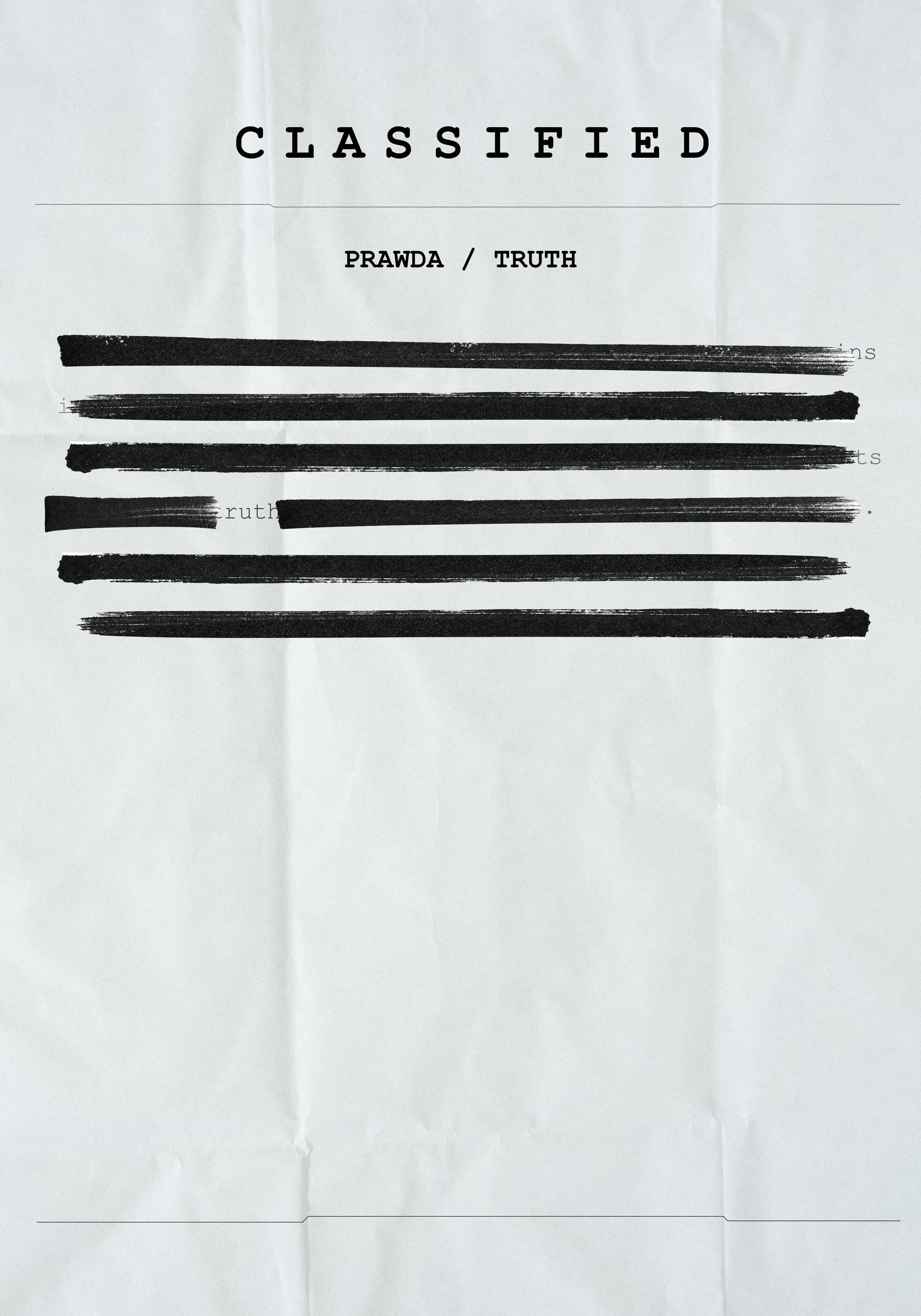
Artwork: ‘Classified’
Are there particular materials, gestures, symbols, places, or visual languages that feel important in your work?
The visual language that feels most important to me is reduced, symbolic, and concept-driven. I often use simple forms, strong contrast, empty space, repetition, and direct visual metaphors. I am drawn to images that do not explain too much, but create a strong emotional or intellectual reaction.
Symbols are very important in my work. A footprint, a line, a shadow, a sentence, a mark, or a repeated shape can become a way to speak about pressure, memory, truth, or survival. I am interested in the moment when something visually simple becomes psychologically or socially charged.
What drew you to present your work with The Alchemical Art?
What drew me to The Alchemical Art was the feeling that the platform is open to work that is personal, symbolic, emotional, and transformative. I felt that my work could exist naturally in that context because it is also interested in transformation — not in a decorative sense, but in the transformation of pain, silence, pressure, and experience into a visual form.
I was also drawn to the opportunity for the work to reach a wider audience beyond my local environment. For me, this is important because the themes I deal with are personal, but they are not only mine. They are human, social, and shared.
What does visibility, exhibition, or being featured mean to you at this stage of your practice?
At this stage of my practice, visibility means confirmation, but also responsibility. Since I came to design and visual art after studying sociology, my artistic path was not completely linear. Being exhibited or featured gives me a sense that this path has meaning and that the work can communicate with people outside of my immediate surroundings.
It also means that the work has a chance to live in public space, or at least in a public conversation. That is very important to me. I see poster design as something that should not remain closed or private. It should meet people, confront them, comfort them, or make them think.
What are you currently curious about, experimenting with, or moving toward in your work?
I am currently interested in going deeper into conceptual poster design and developing a more personal visual language. I want to continue exploring the relationship between social themes and intimate emotional states.
I am also curious about how little an image needs in order to say something powerful. I want to experiment more with reduction, silence, symbolism, and the emotional effect of empty space. My goal is not only to make visually strong work, but work that feels necessary.
What advice do you have for other artists?
My advice to other artists would be to stay honest with the reason they create.
I would also say: do not be afraid of simplicity. Sometimes the simplest image can carry the most difficult truth.
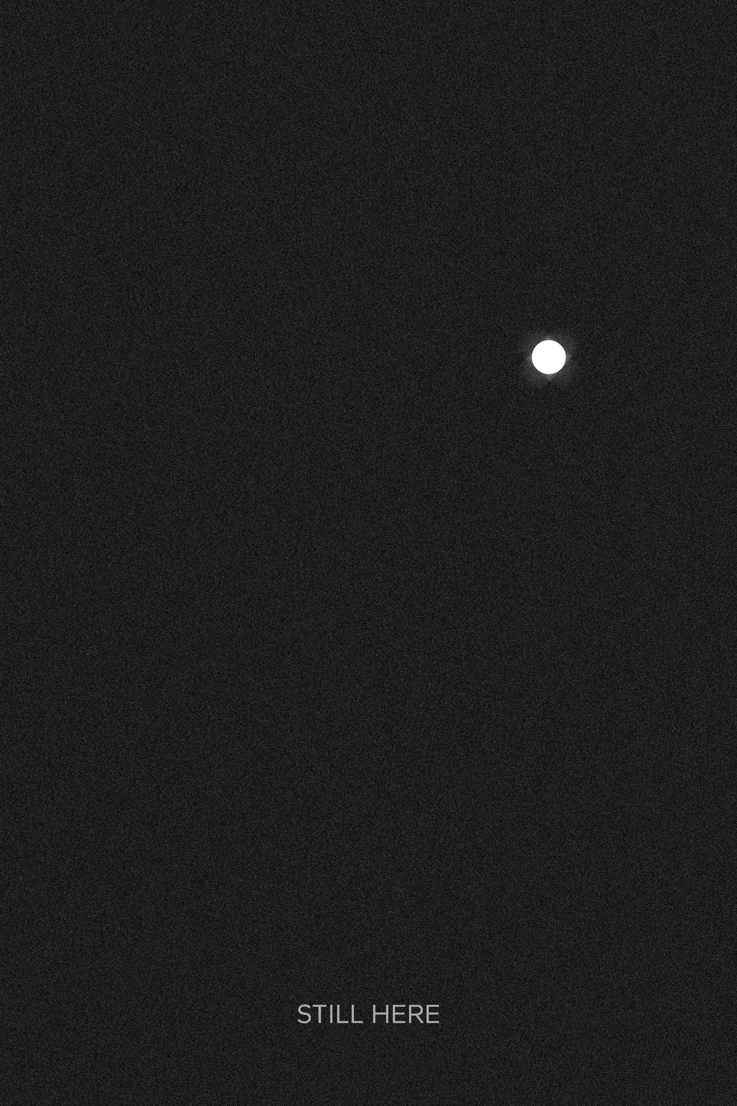
Artwork: ‘Inspiring Hope’
“I would like viewers to carry with them the thought that what we see on the surface is often only a small part of what a person is living through. Sometimes a simple sentence like “I’m fine” can hide an entire inner world.”